Data visualization for RBC (web, magazine, newspaper)
2016—2020
rbc.ru (RosBusinessConsulting)
Position: Lead Designer
RBC is a group of companies and one of the largest multimedia holdings in Russia.
RBC's main audience (3.5 million people per day) is entrepreneurs for whom it is important to receive current news about economics, finance and politics.
I responsible for the direction of infographics as lead designer from 2016 to 2020. I create visual style and guide for infographics and data visualisation. More about that (text version) or my performance at Design&Media.
Results
✦ Developed regulations for ordering infographics;
✦ We set up logistics through different platforms: website, magazine, newspaper;
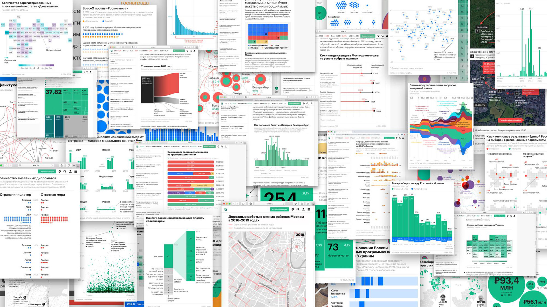
✦ Published more than 1000 materials with infographics;
✦ Developed a style, guidebook, templates for infographics and covers.
Rules, templates and styleguide
One of the main task is to help develop infographics on all platforms: website, magazine, newspaper. In 2016, all platforms had different font sets and approaches to creating infographics. Data came from different sources, there were no clear regulations and templates for creating technical specifications, and there were no guides for creating infographics.
After the process of ordering infographics was established and we had developed a number of solutions, we formulated basic recommendations for infographic design.
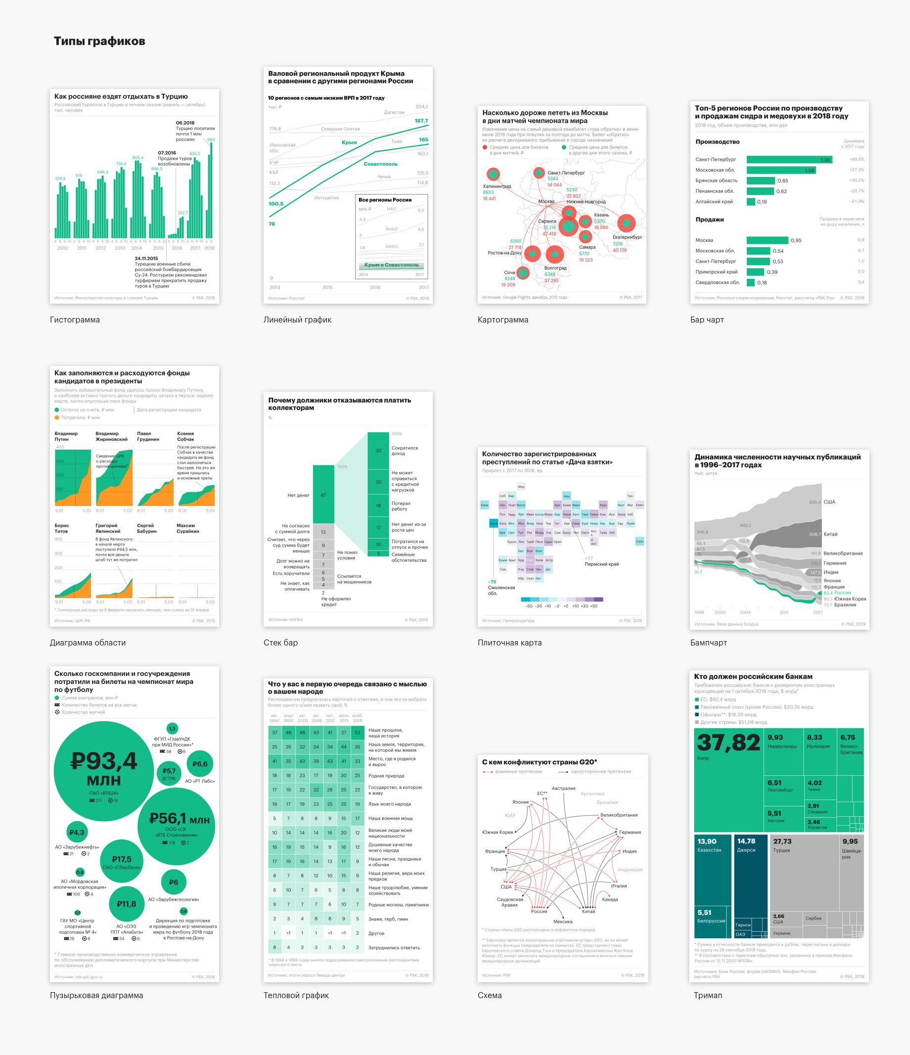
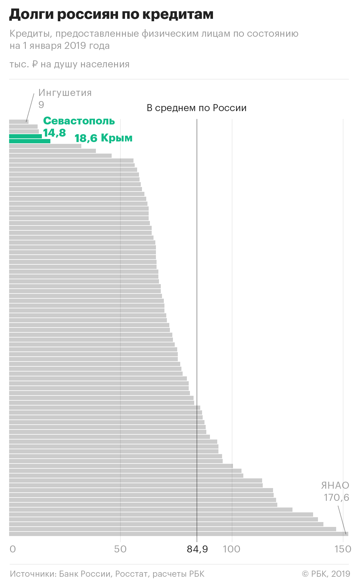
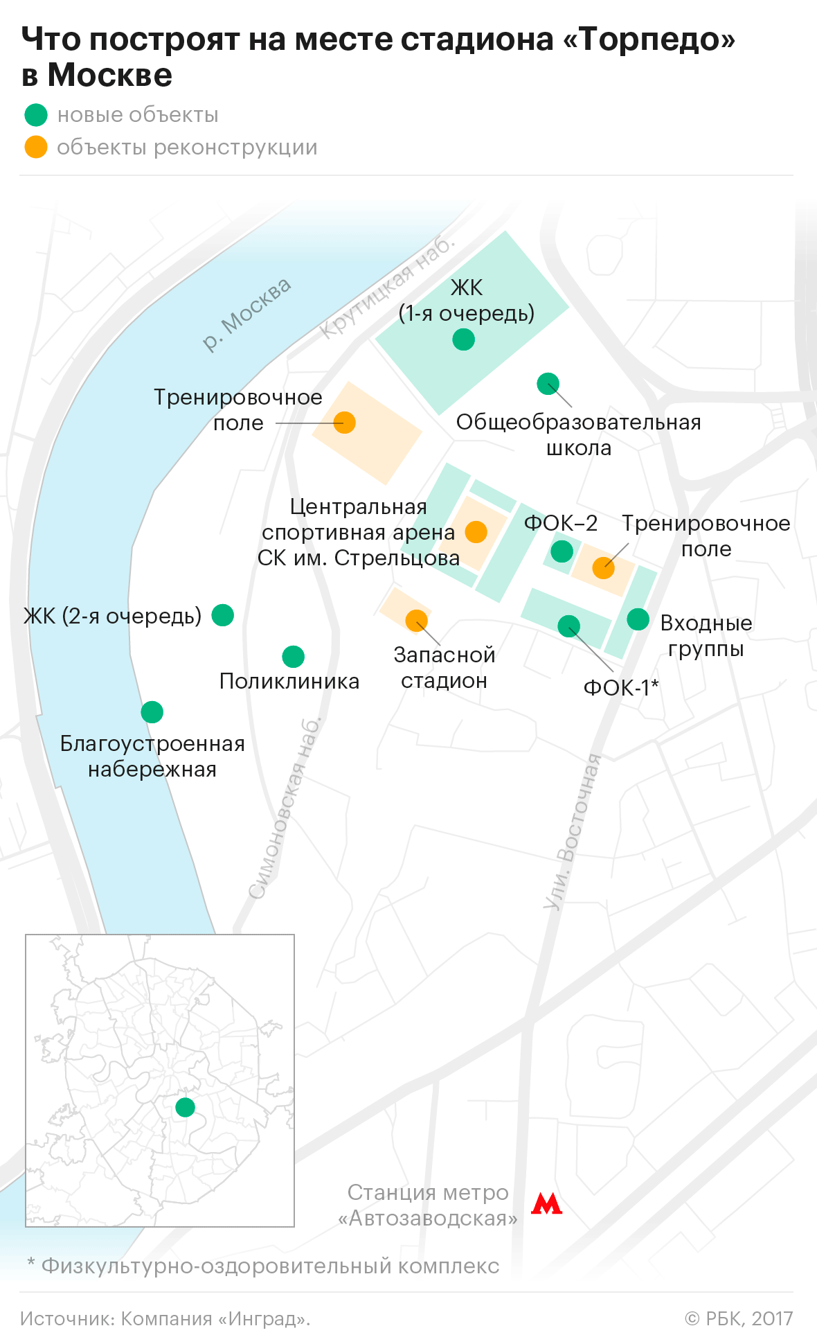
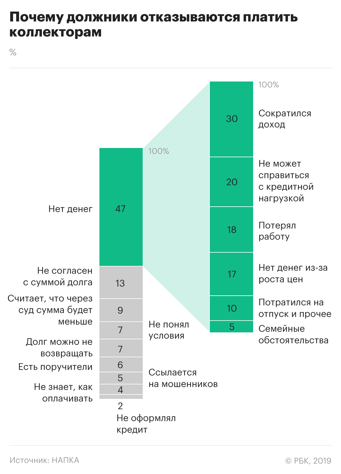
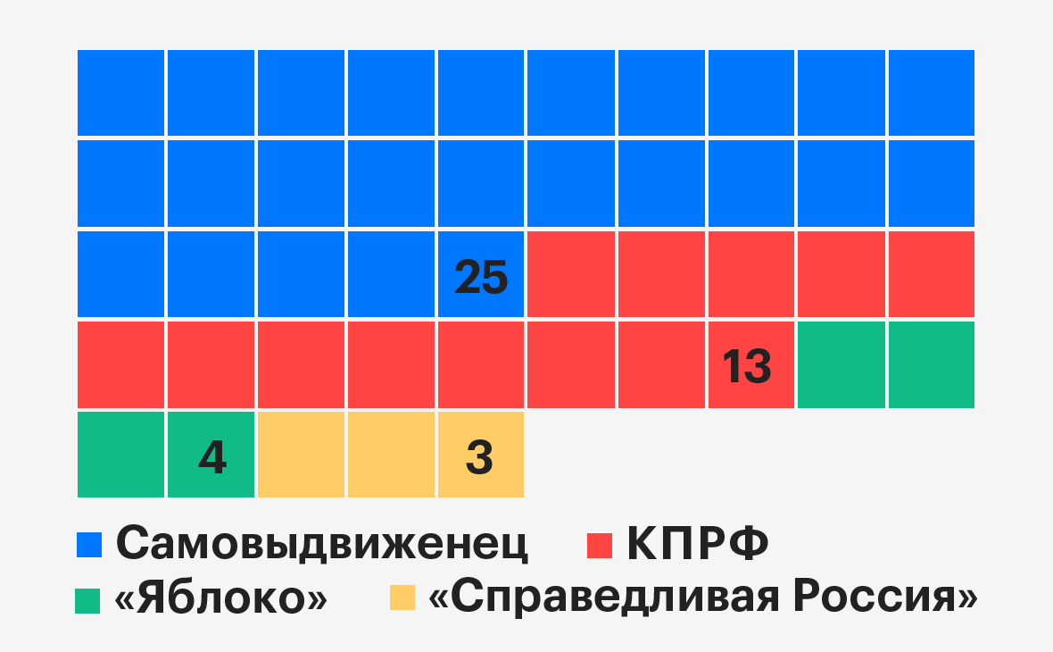
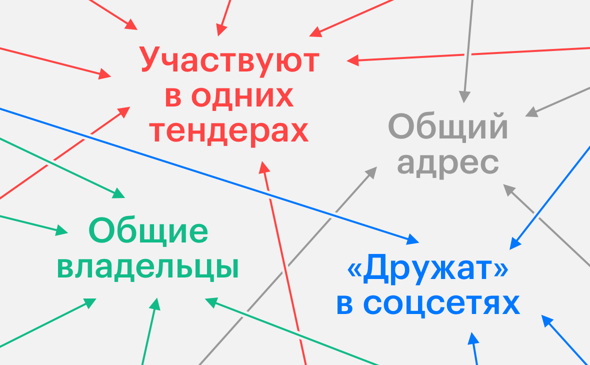
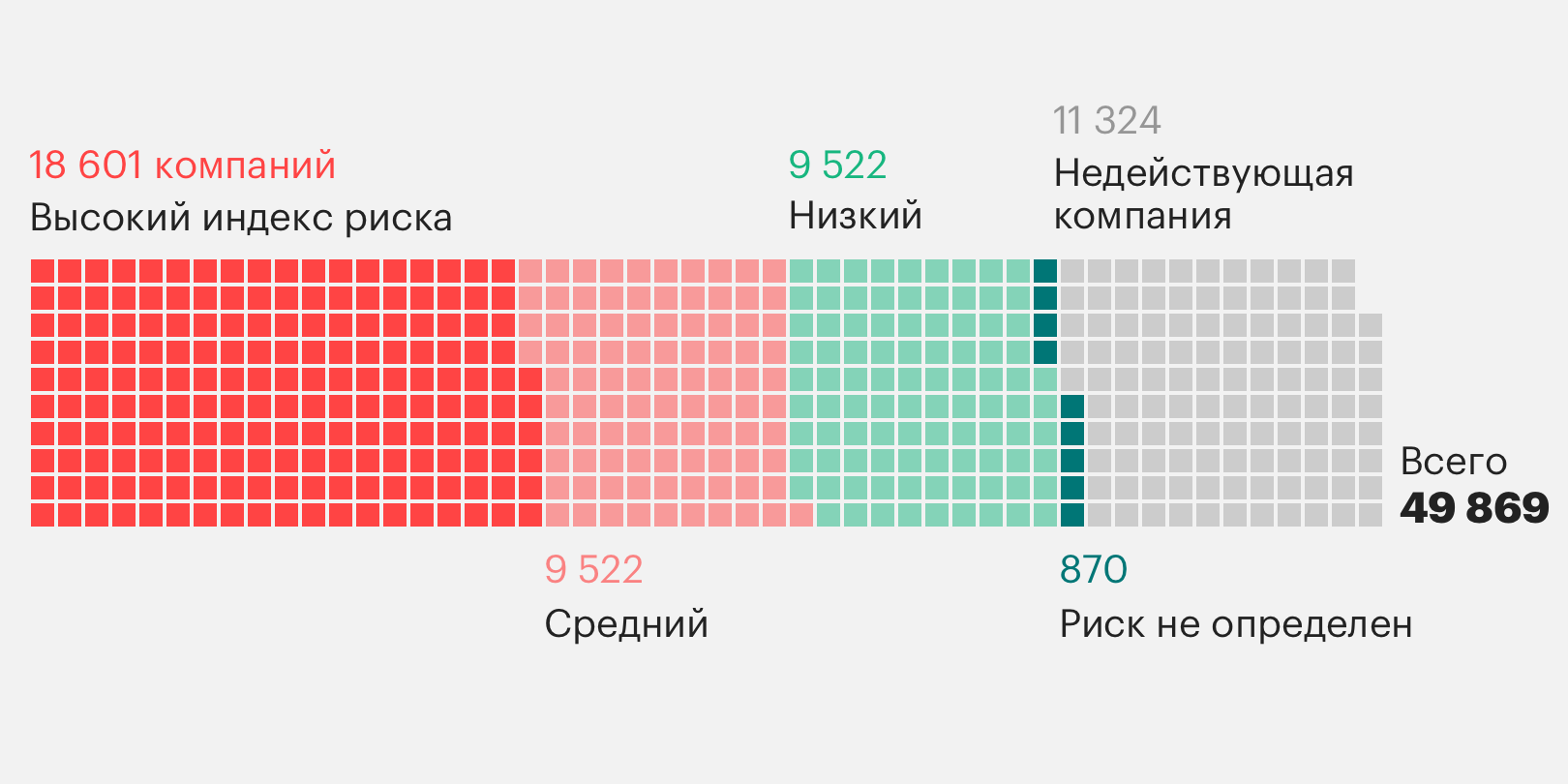
In addition to the simplest forms of visualization (piece chart, bar chart and graph), we began to introduce more complex ones (trimap, stackbar, bump chart and so on)
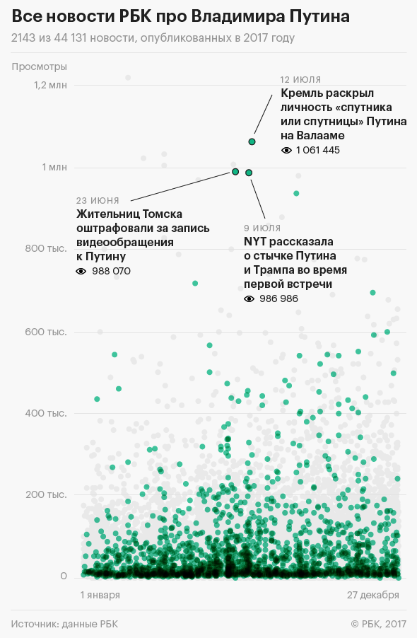
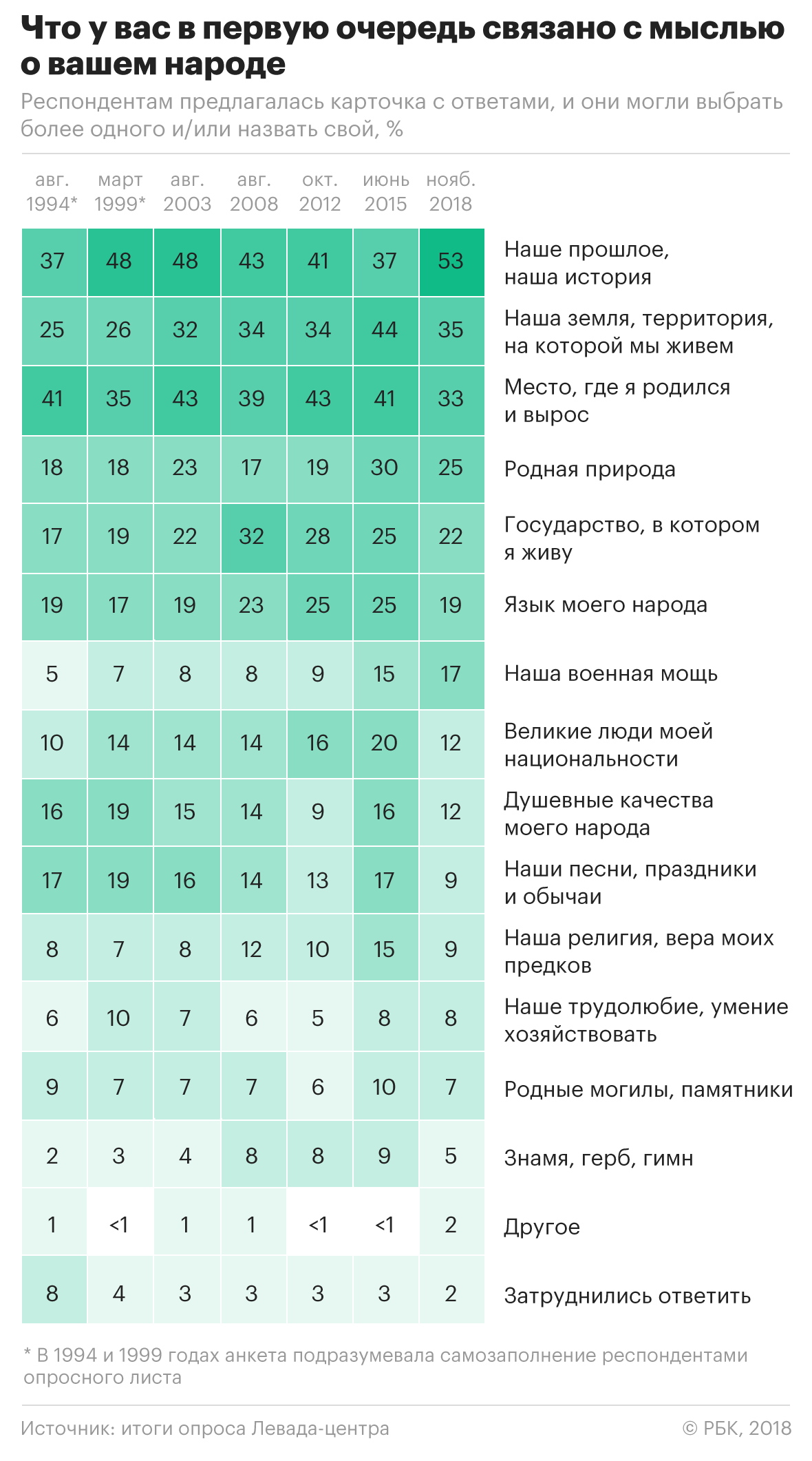
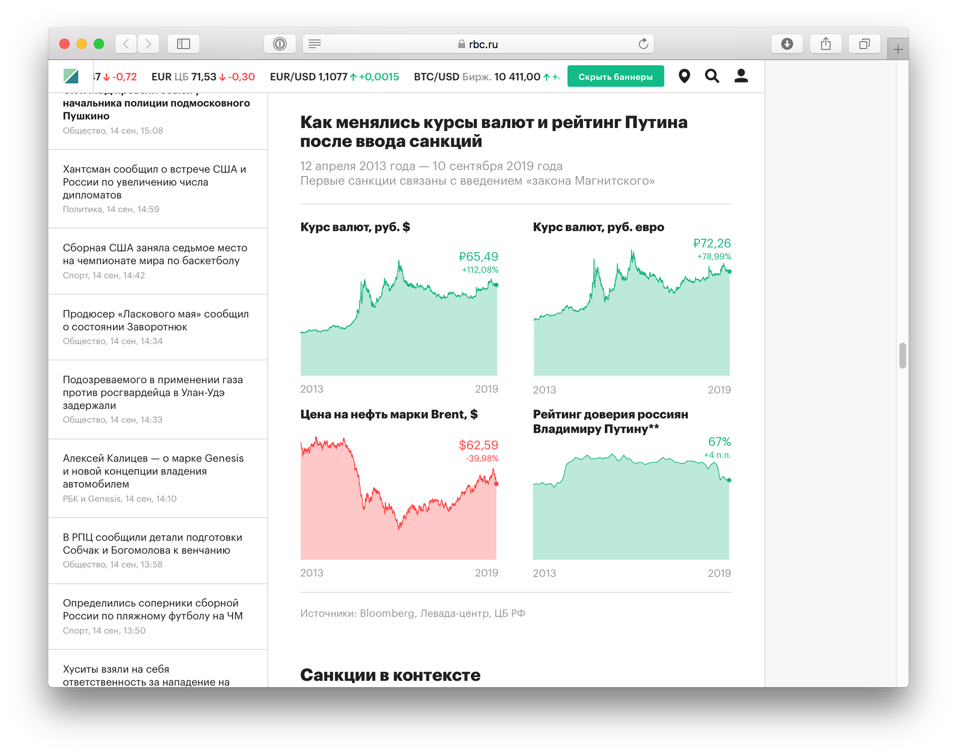
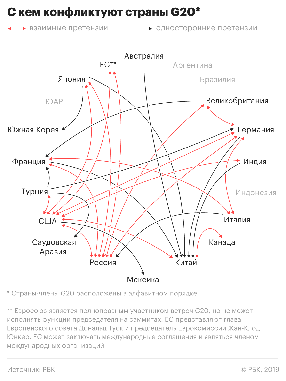
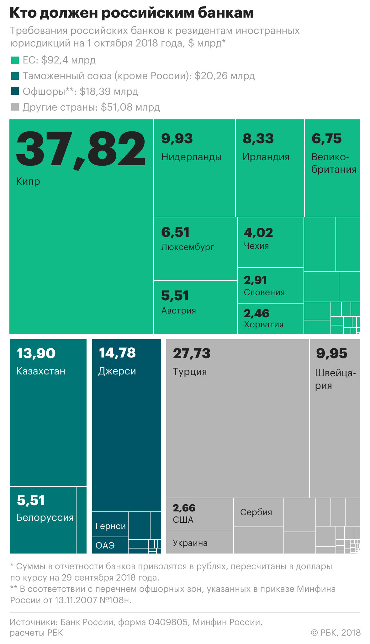
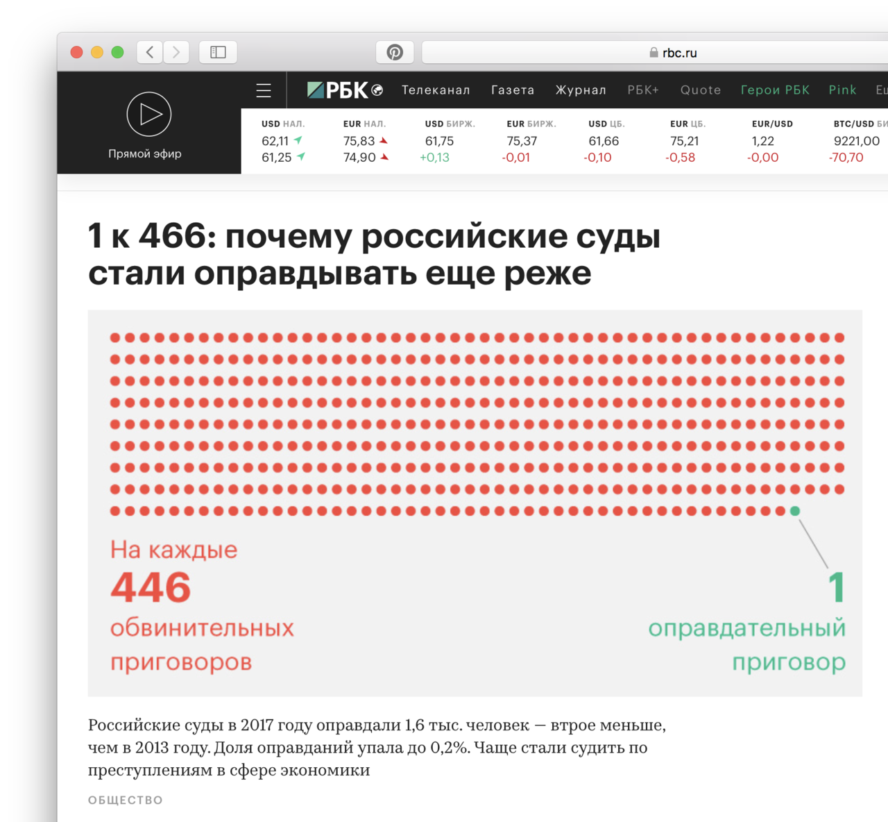
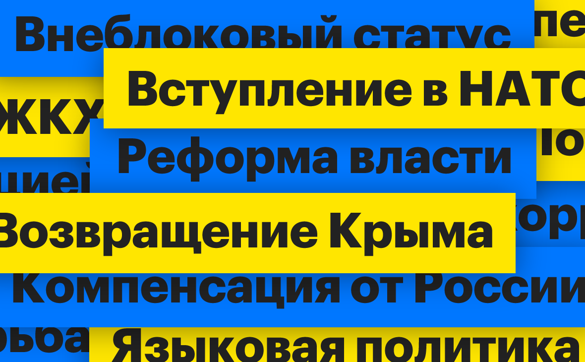
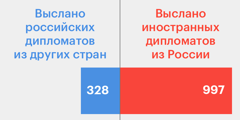
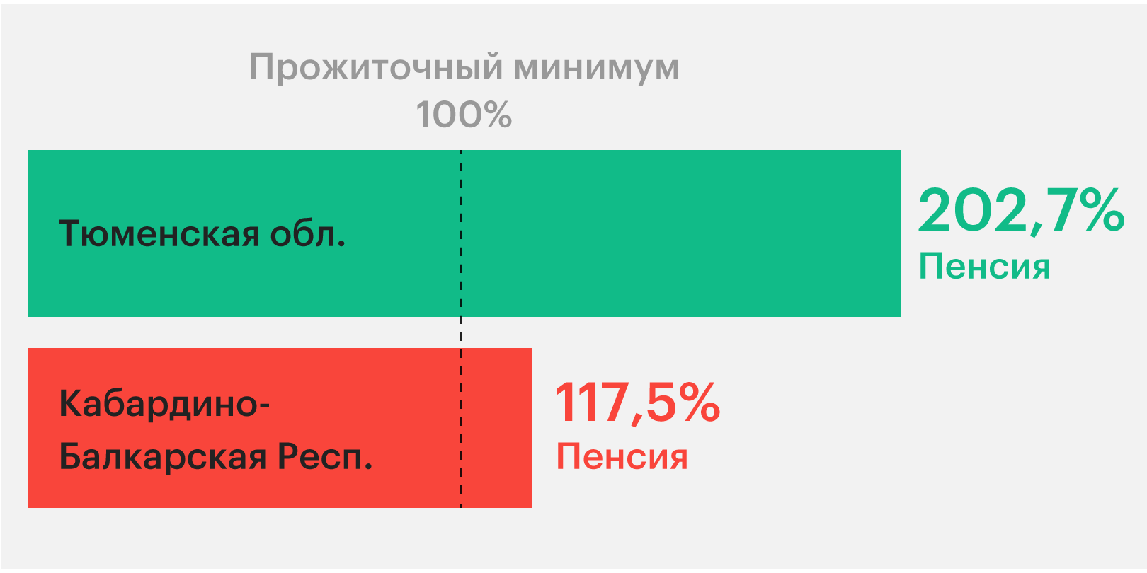
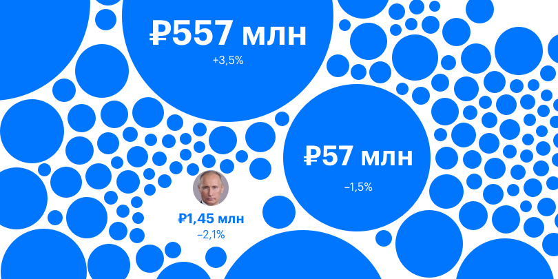
On the site, we abandoned complex infographics. One picture - one thought.
Native for website
For the infographics, we took all the main site styles to make it look native
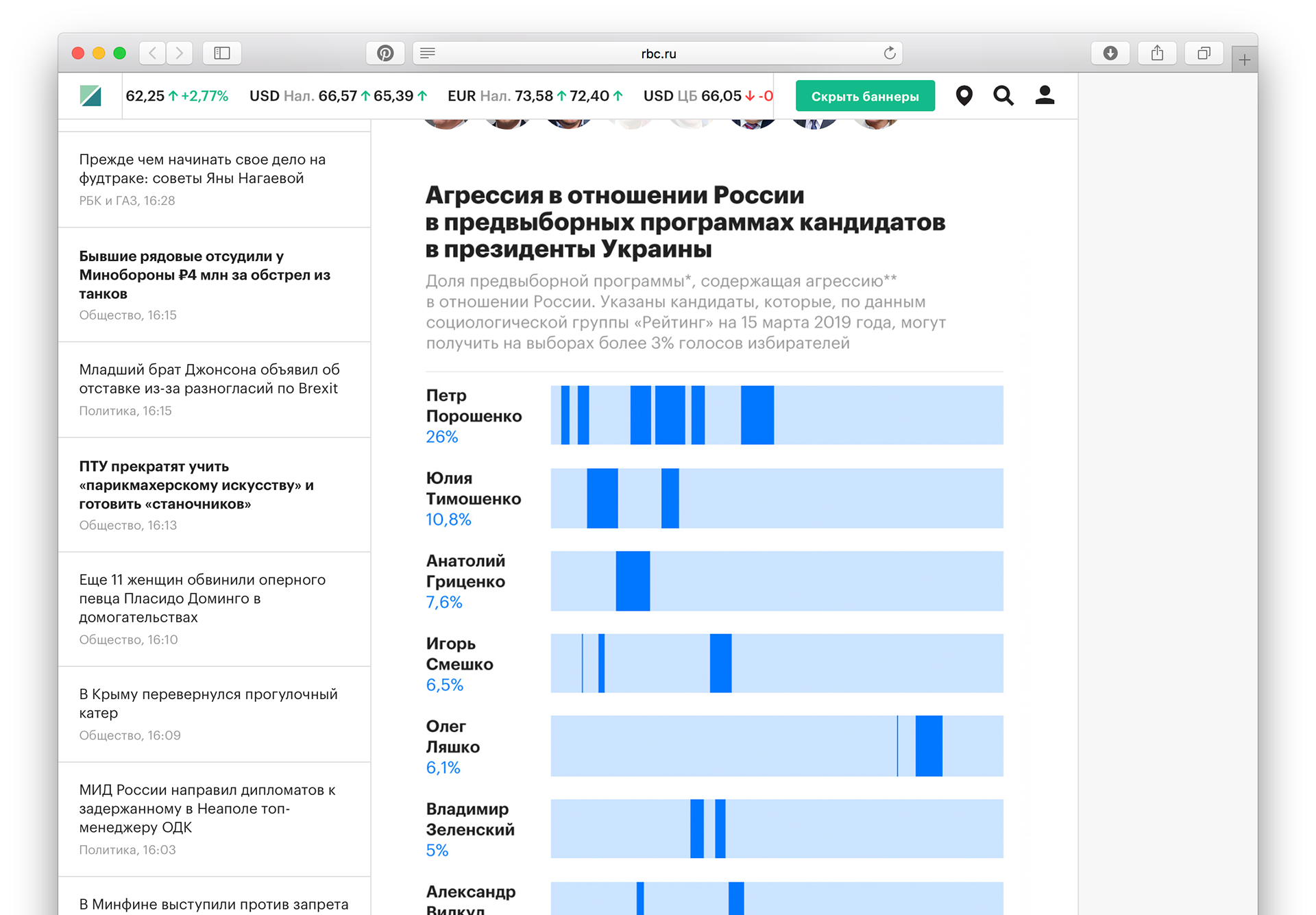
On the site, we abandoned complex infographics. One picture - one thought.
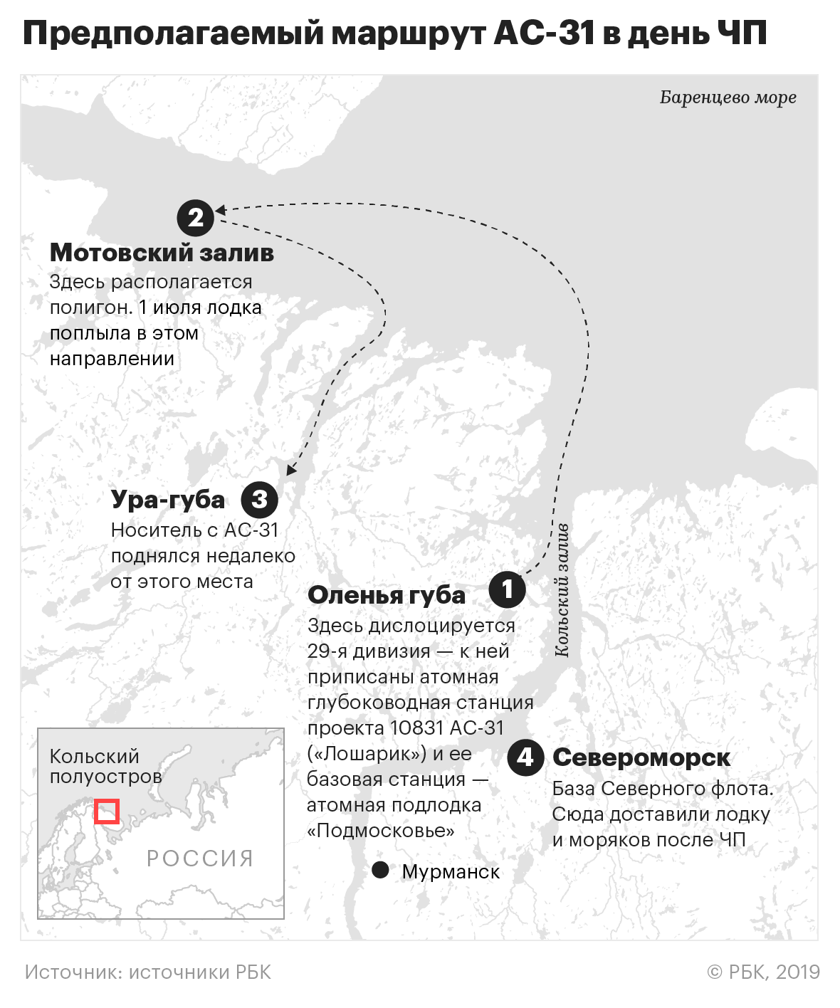
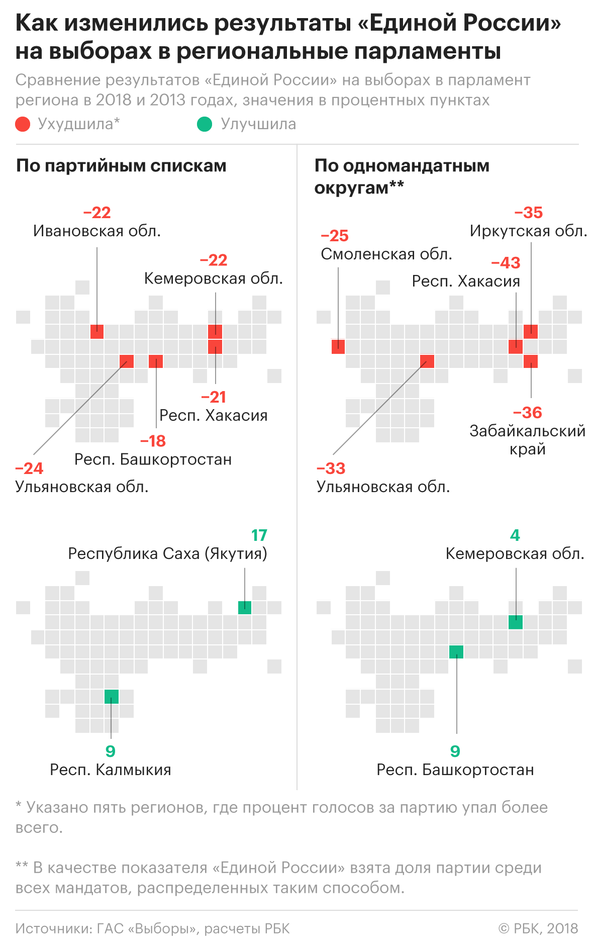
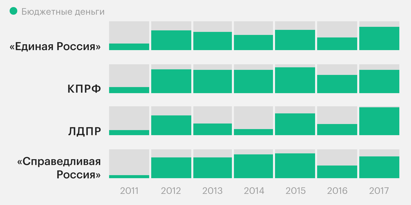
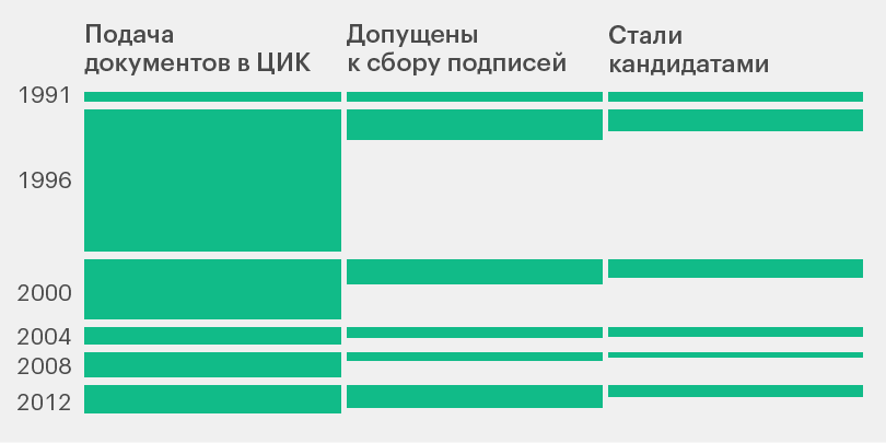
Composite infographics for magazine
The magazine allowed for experimentation with the presentation of data, as it had a larger format and allowed for longer interaction
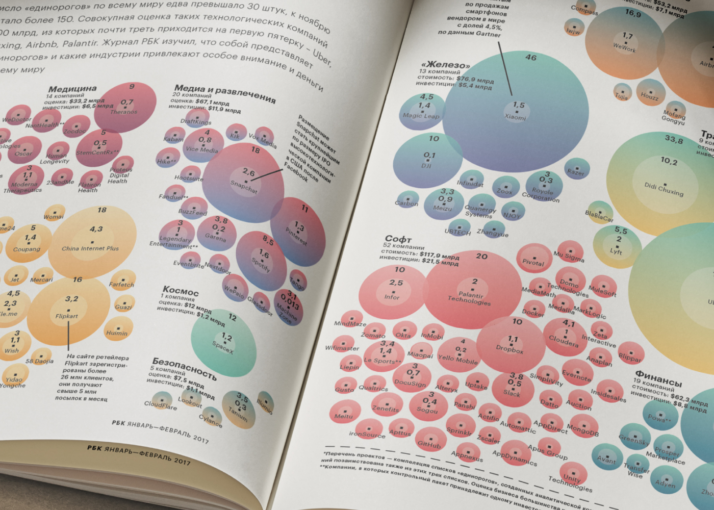
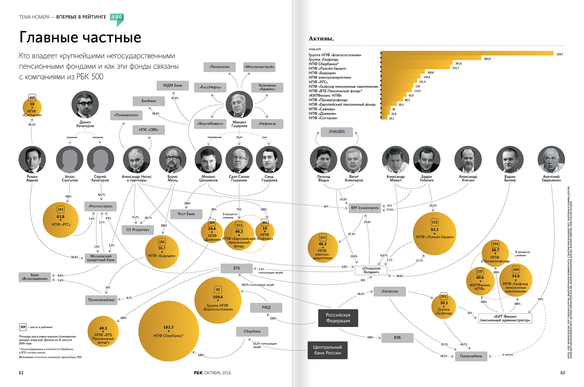
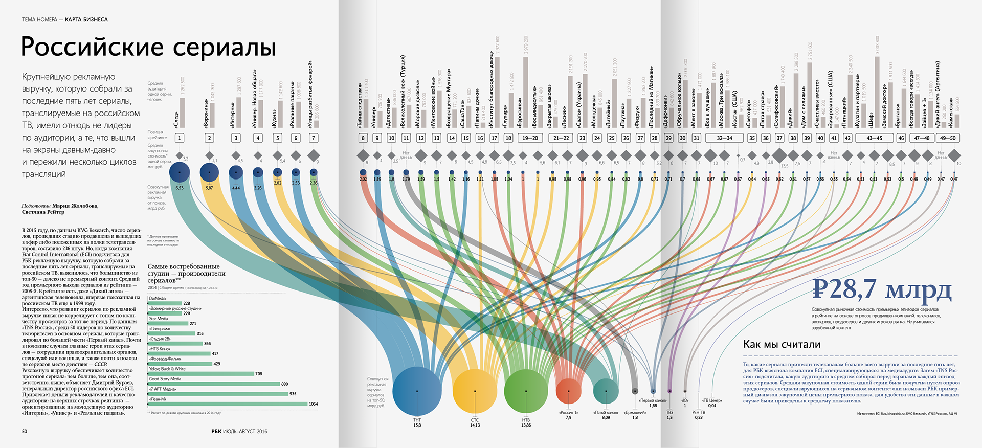
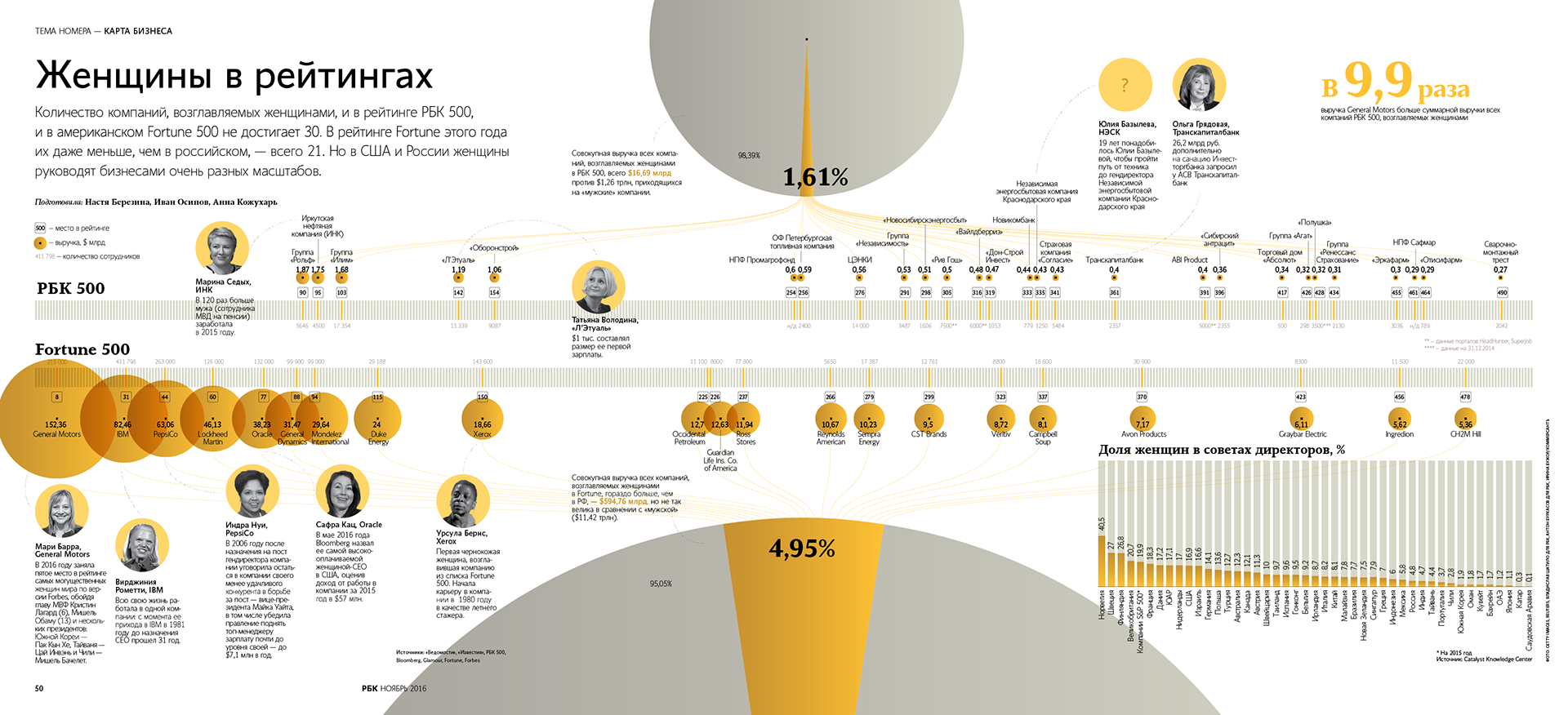
Particular attention to how a person interacts with content. Therefore, magazine graphics are usually richer in information layers.
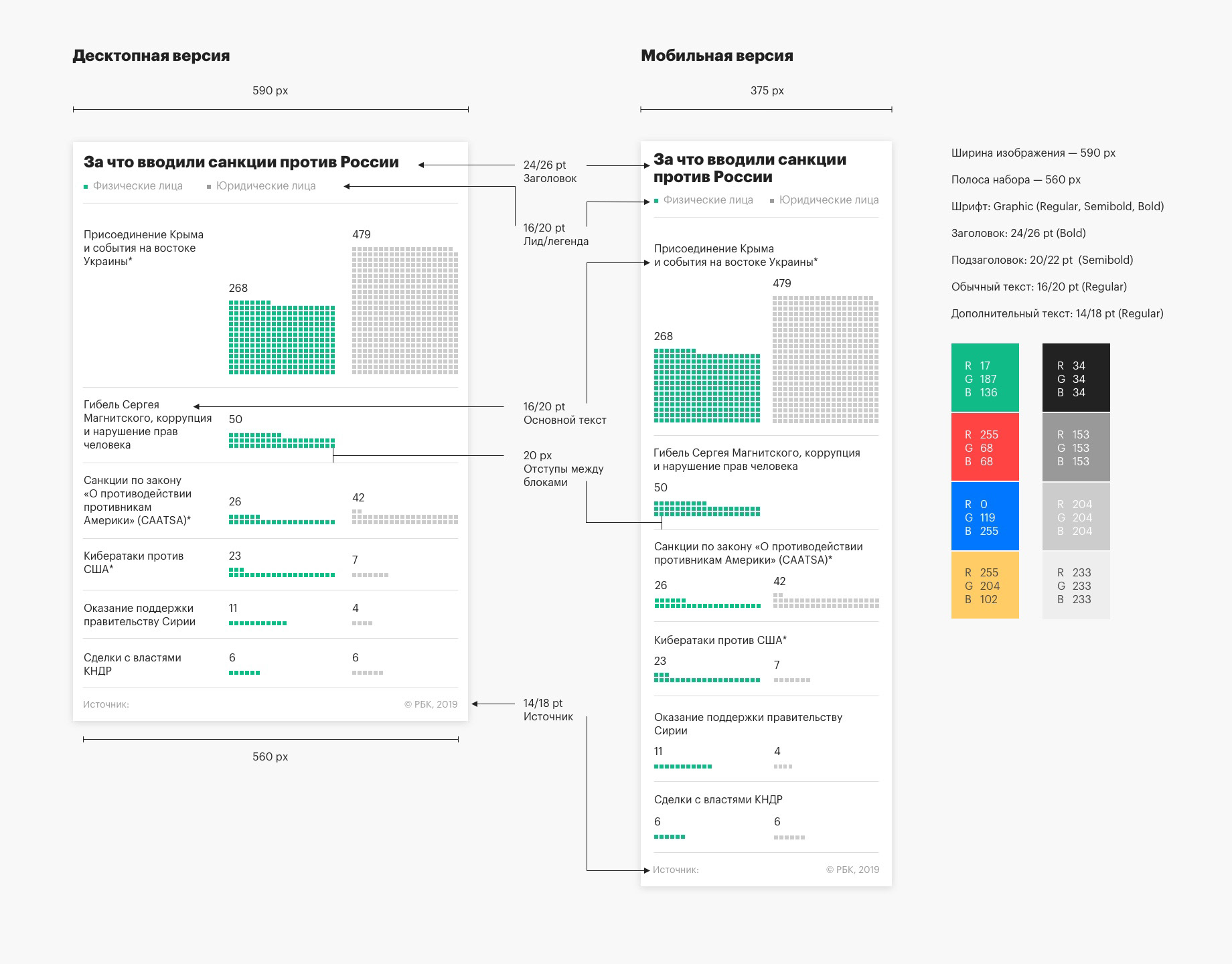
Adapting to the platform
The infographic might first appear in a magazine, and then be adapted for the website. Or the publication from the website was adapted into a newspaper.
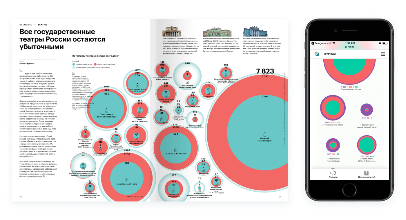
From magazine to website
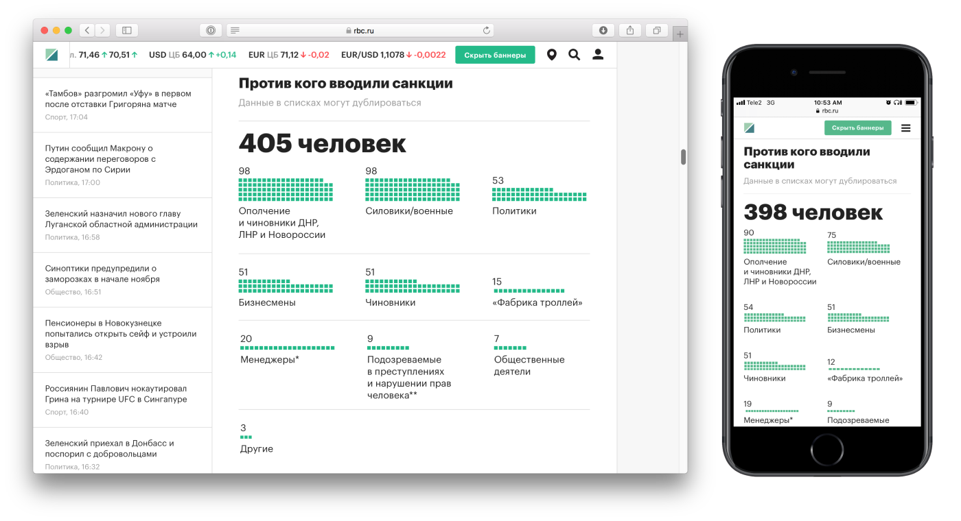
From desktop to mobile
Design of covers
For some publications we make covers with infographics. We rework and adapt the key idea so that the graphics are readable even in small formats. This increases conversion, for example, when posting on social networks.
The first touch with the publication was more effective than a photo or an abstract fragment of a chart
Covers not only added variety to the news feed, but were also better aggregated by search engines.
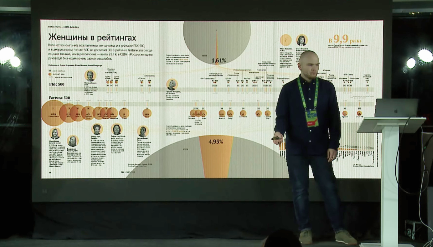
You can watch my talk about RBC infographics at the Design and Media 2019 conference
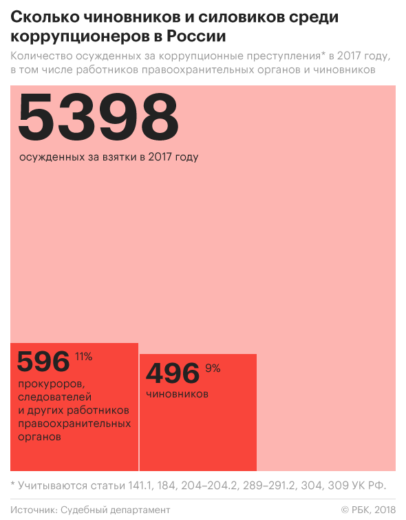
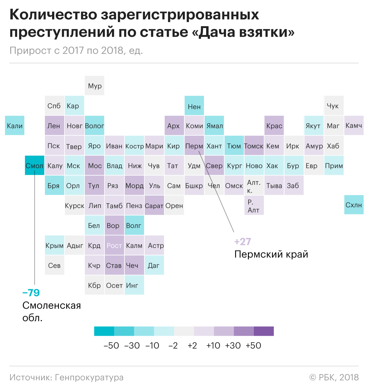
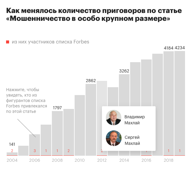
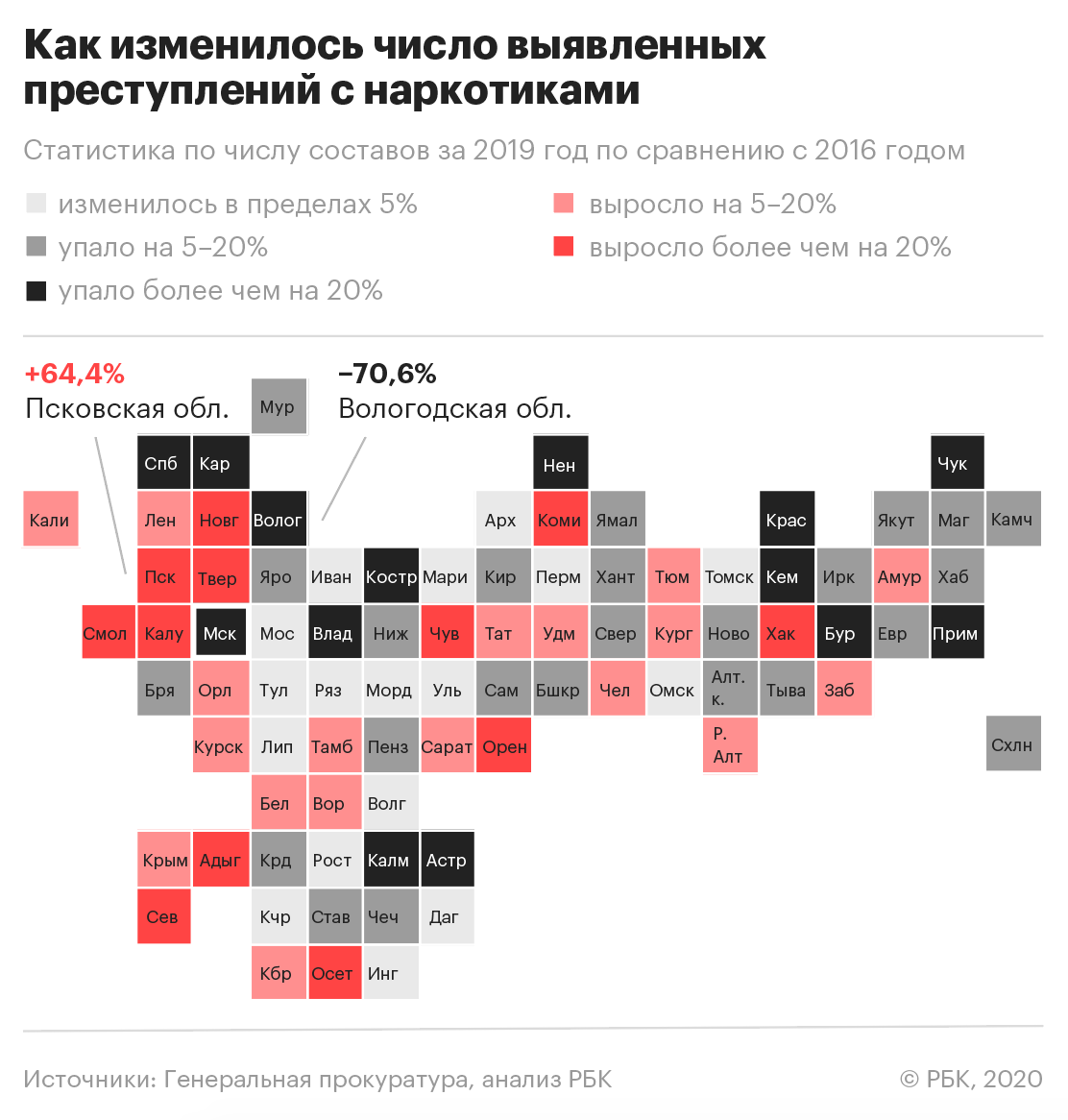
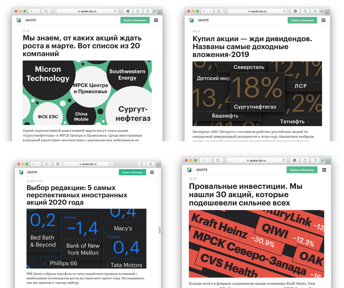
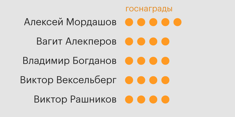
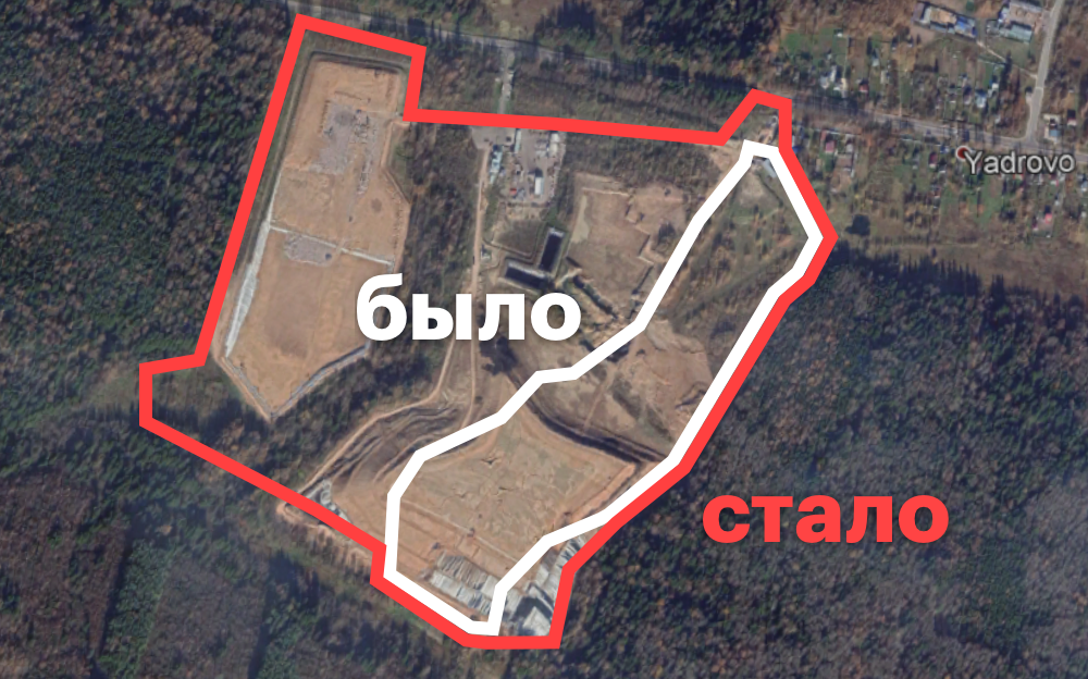
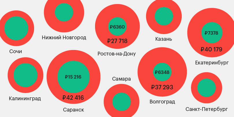
Some publications
✦ Thanks for watching