Restart of the infographics department
2020—2023
International Media Group Rossiya Segodnya
Position: Deputy Department Head/Lead Designer
Team: 8 people
The Rossiya Segodnya media group unites Russian-language information resources, including RIA Novosti, PRIME, InoSMI, TOK, KOT, Baltnews, Social Navigator and Arctic.ru. It is represented abroad by the international news agency and radio Sputnik in more than 15 languages, including Chinese, Arabic and Hindi.
As Deputy Department Head i was responsible for the sense of the projects and worked on optimizing production: i developed templates, instructions, helped designers and editorial teams to release infographics.
Results
✦ We collected the main regulations (briefs, scripts, checklists) for clients and designers.
✦ We analyzed all the main bottlenecks that affected the order production time. As a result, the minimum cycle was reduced to 20 minutes.
✦ In the first year, we completed 450 projects, 1180 in 2021 and in 2022 there were already about 1400.
✦ We implemented a mobile first system, where the designer always started working with the mobile version, and had the opportunity to finish the desktop version after publication.
✦ We created a common knowledge base where all projects could be found, which also served as a task manager for designers
Rules for clients
We managed to solve key problems: time, resources, quality. And we set up processes and increased production volumes for more than 10 brands. In the first year, we completed 450 projects, 1180 in 2021 and in 2022 there were already about 1400.
How we do it with small team? First a whole is the focus on hidden problems and fresh look on process. The designer has ceased to be a tool and has become part of the thought process. We automated everything that could be automated. We removed all the resources, and instead posed the question like this: "how to solve this problem with minimal resources? With using nothing."
Database for designers
We were looking for a task manager that could also be used as our database. As a result, we chose Notion, where we created a new task-project, and the same card contained all the key information, including the source files.
Templates for all
We templated layouts for designers, and made simple templates for clients. Sometimes entire tools were developed if they saw that the task fit into a pattern and was repeated many times.
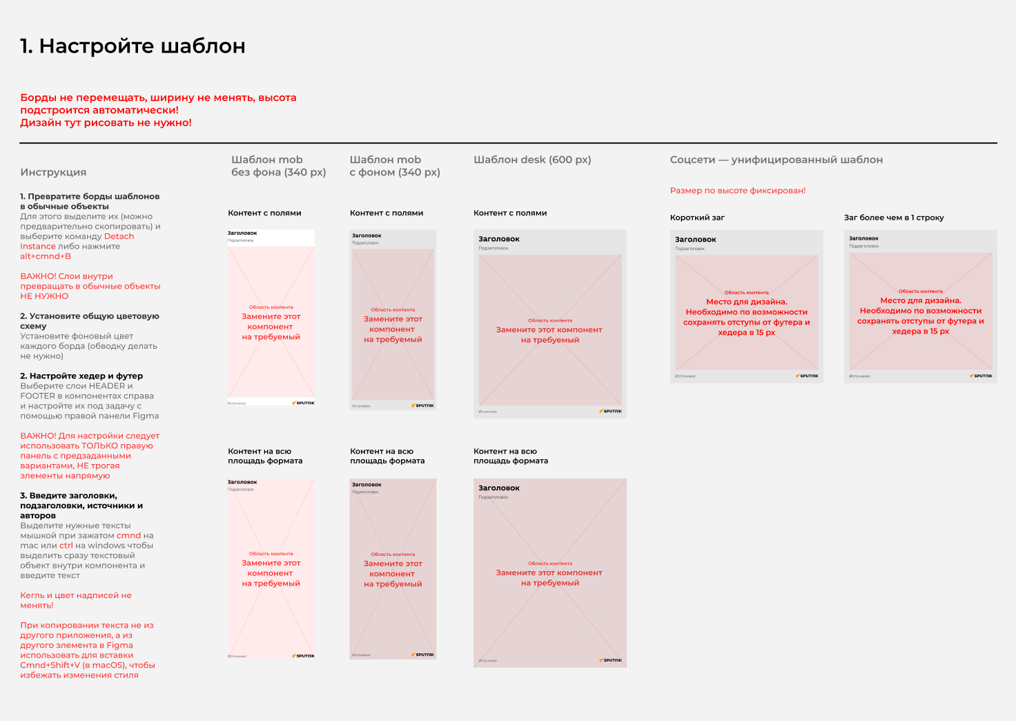
We have developed a template for an infographic on the components of a Figma. This template allowed us to speed up the process of producing several versions of graphics. We prepare several version at once: mobile, desk and for social media
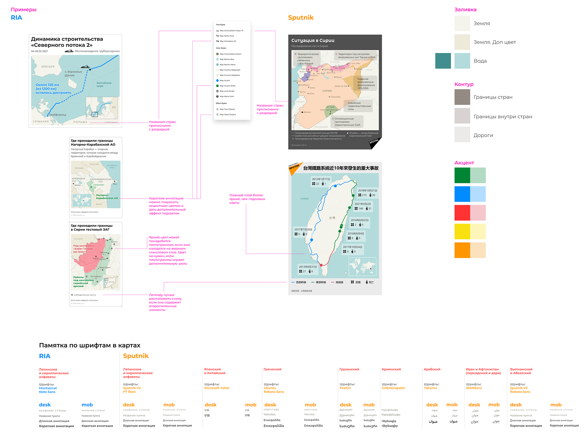
We have developed rules for the design of maps and prepared a template in QGIS. This made it possible to reduce a little time in order to generate the desired area and detail.
Mobile&Social Media first
Social networks have become an important source of traffic, so when designing templates, we looked for universal infographic sizes that could be optimally integrated onto a mobile device, social network, or computer screen. Often we had to make a separate version for the desktop.
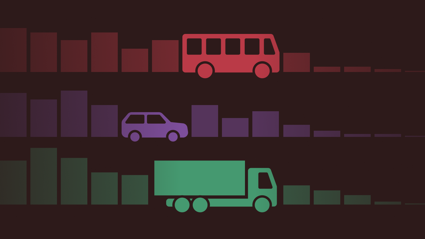
All types of graphics for many teams
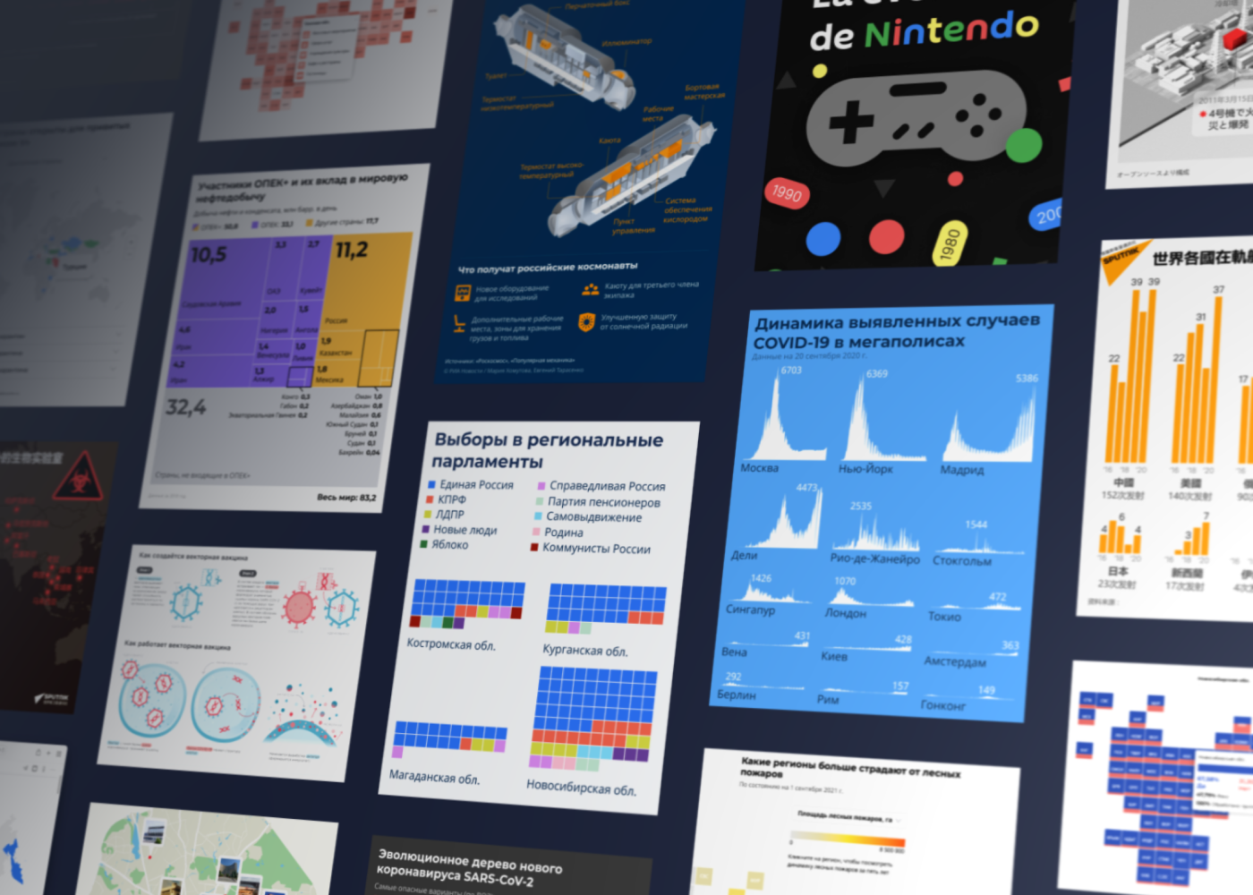
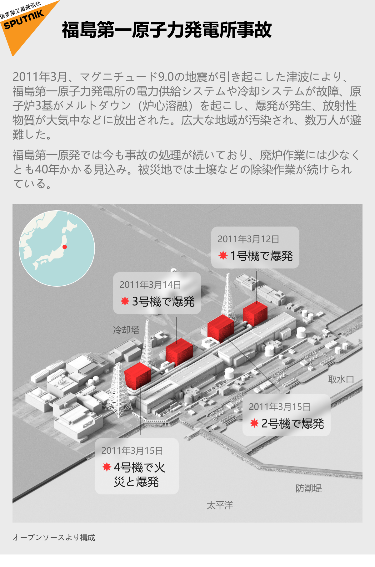
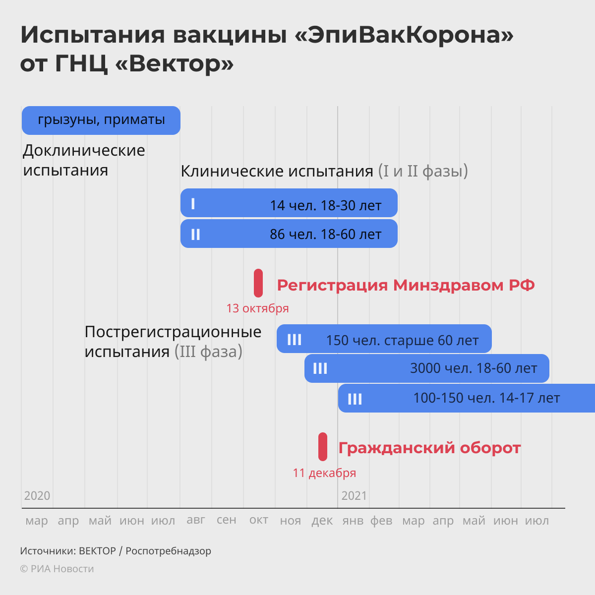
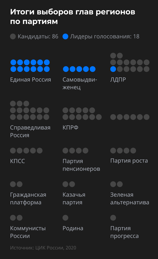
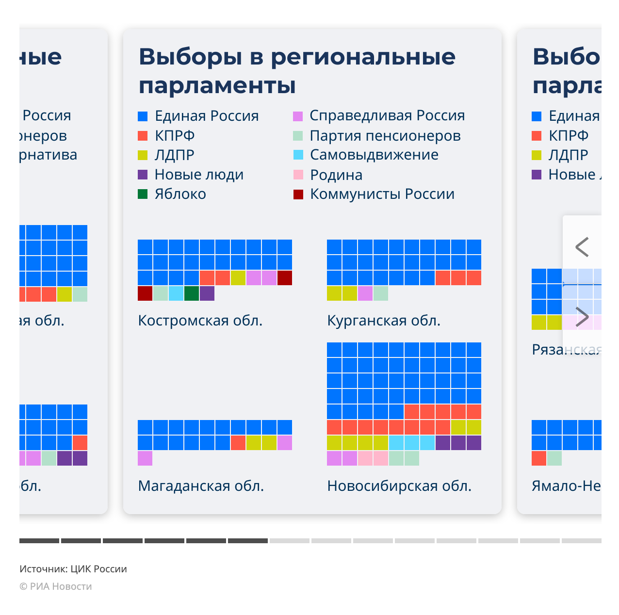
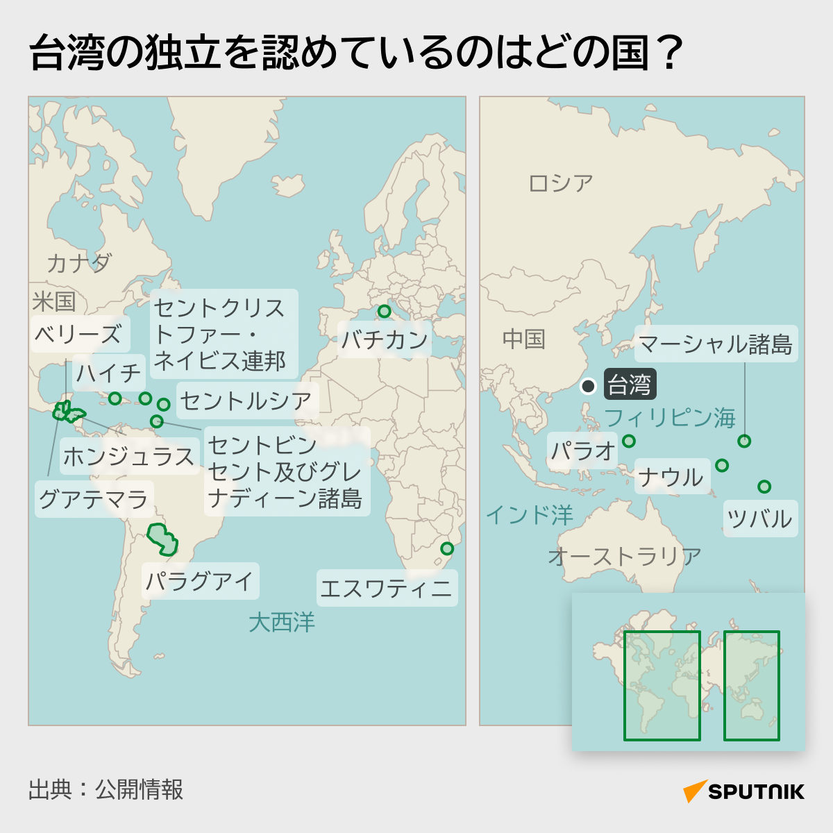
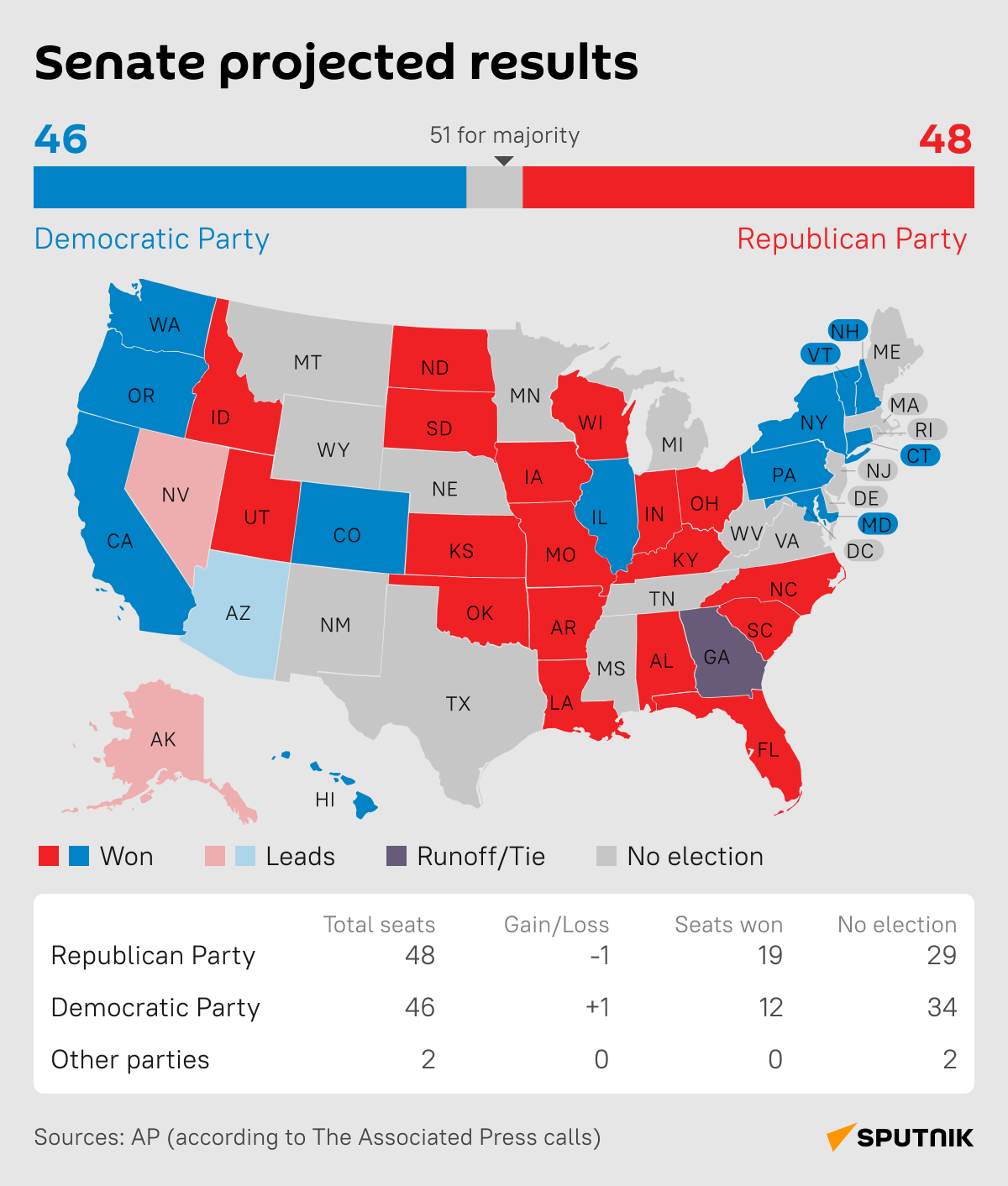
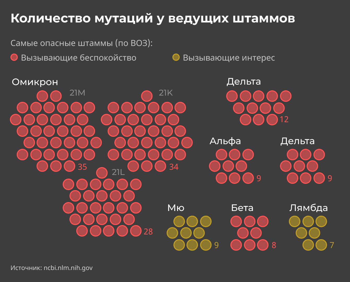
We set up processes and increased production volumes for more than 10 brands with different design. We used all the main types of infographics: diagrams, charts, maps, and technical illustrations. It was a great experience to create scientific illustrations, 3D reconstructions, interactive data visualizations, and storytelling with art graphics.
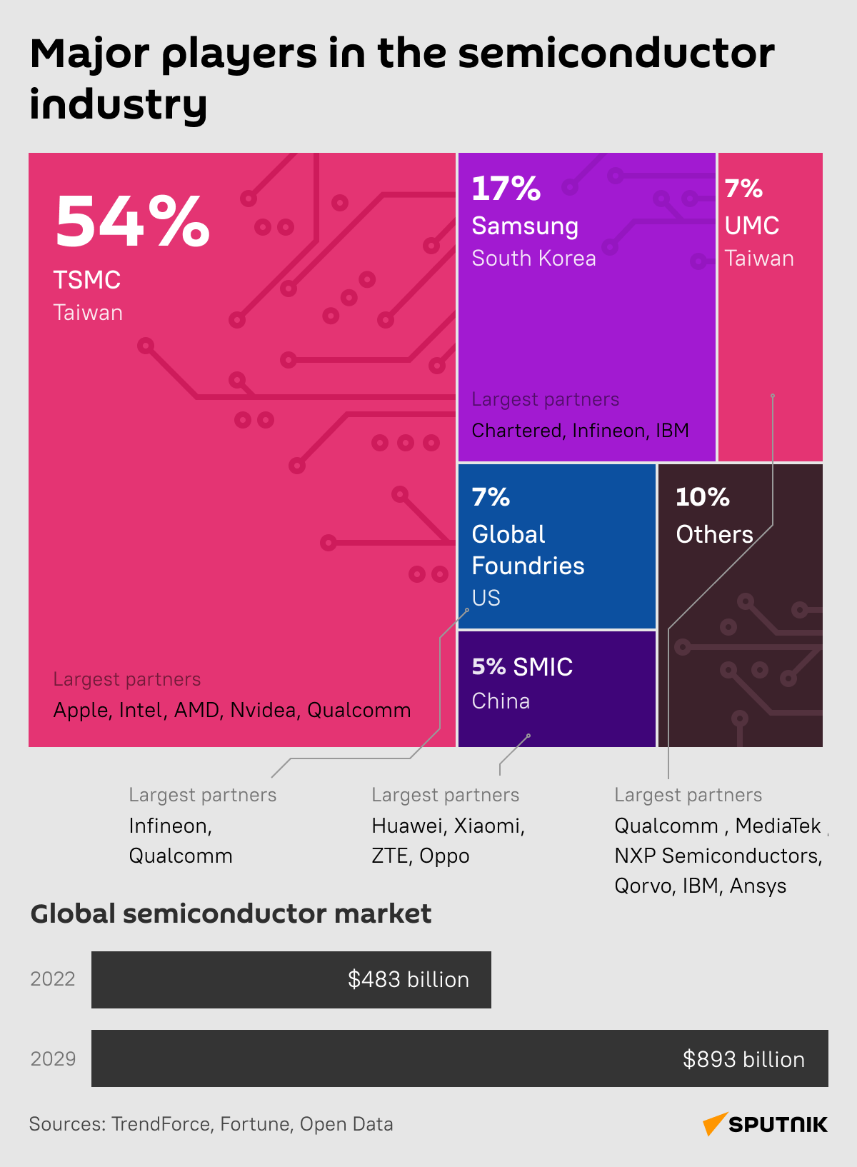
We used outsourcing for some of the tasks. For example, for 3D modeling or complex cartography.
Multiple versions with different languages
It was often necessary to adapt one version to different sizes and languages.
From one picture, we can generate many variants for different teams and brands.
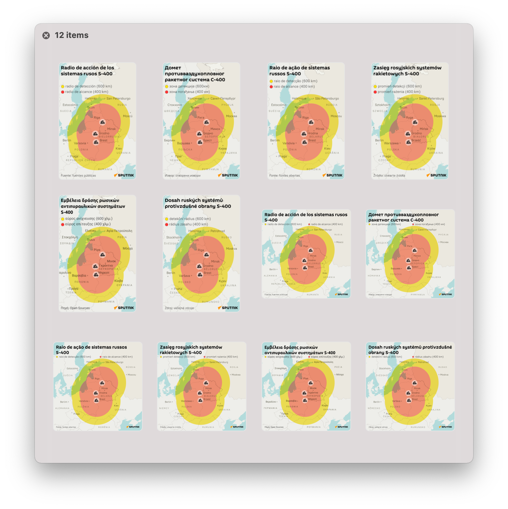
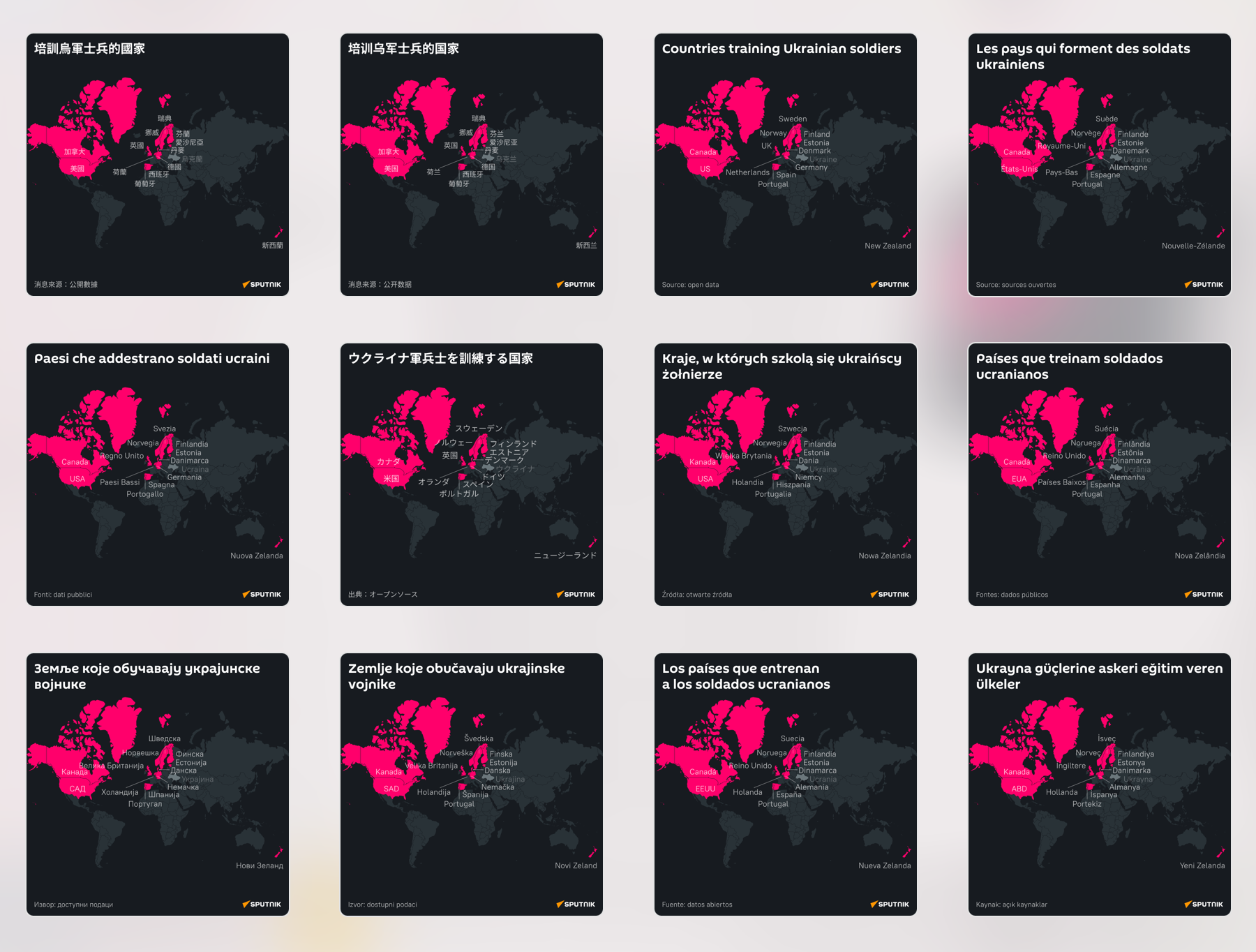
For fast generation, we used the synchronization of Google Sheets and Figma, so that the translations of infographics into different languages took a few minutes and did not require manual labor.
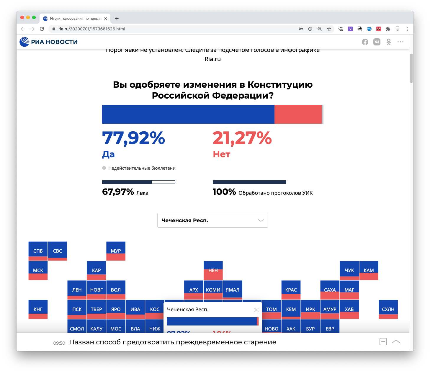
Interactive only if it's hasn't other way
Almost all problems can be solved using a static image. Interactive is time-consuming and expensive. Interactive should be appropriate. For example, if the data is updated in real time.
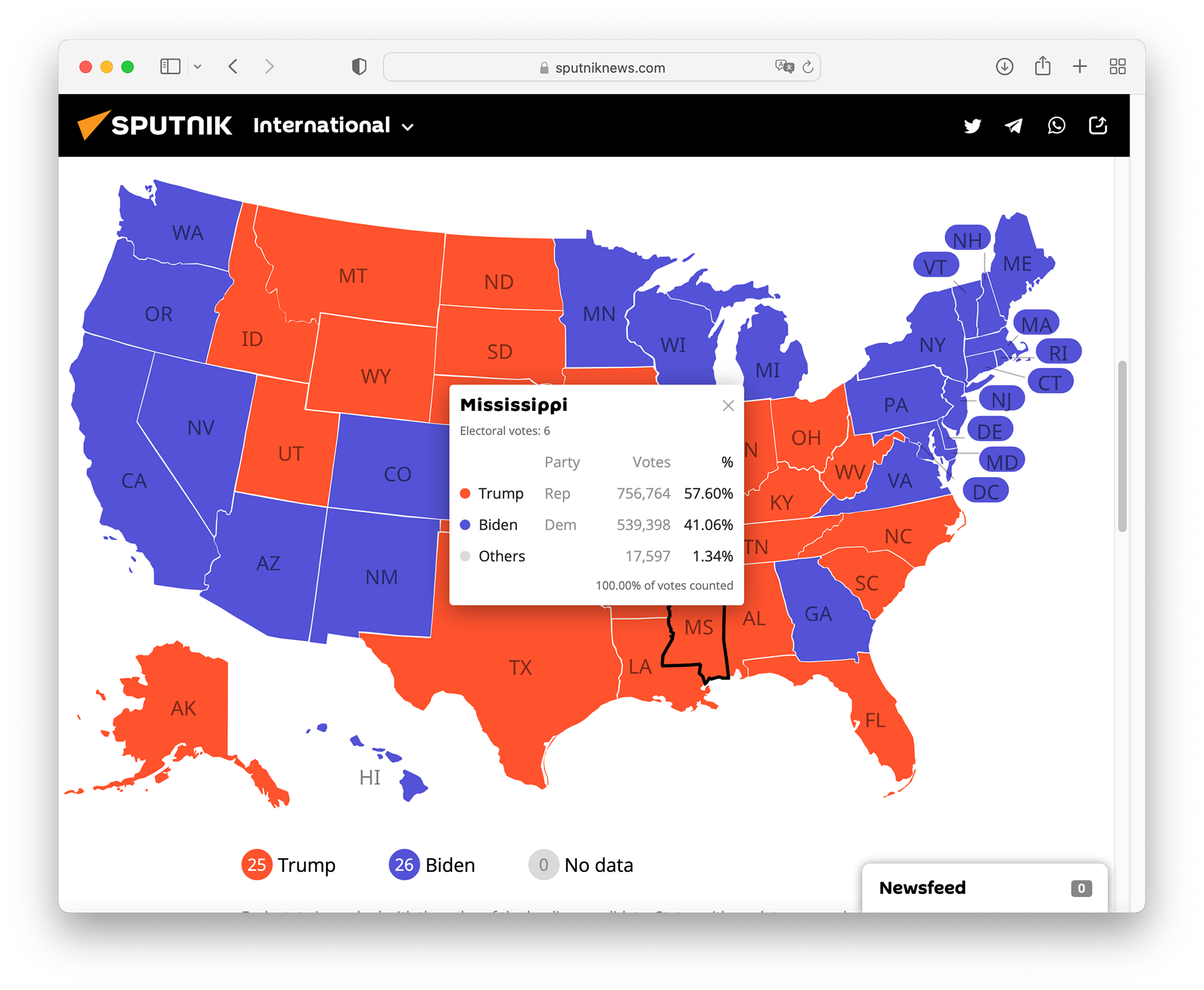
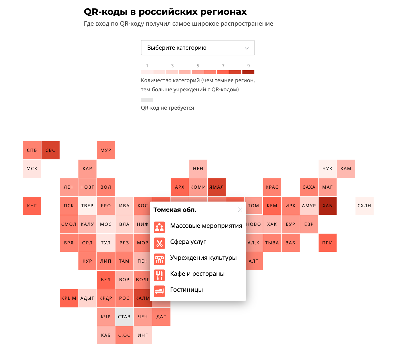
If the project has the potential to repeat itself, then we can make an interactive template out of it. As a rule, it can be filled by the editorial board itself, without the participation of the designer.
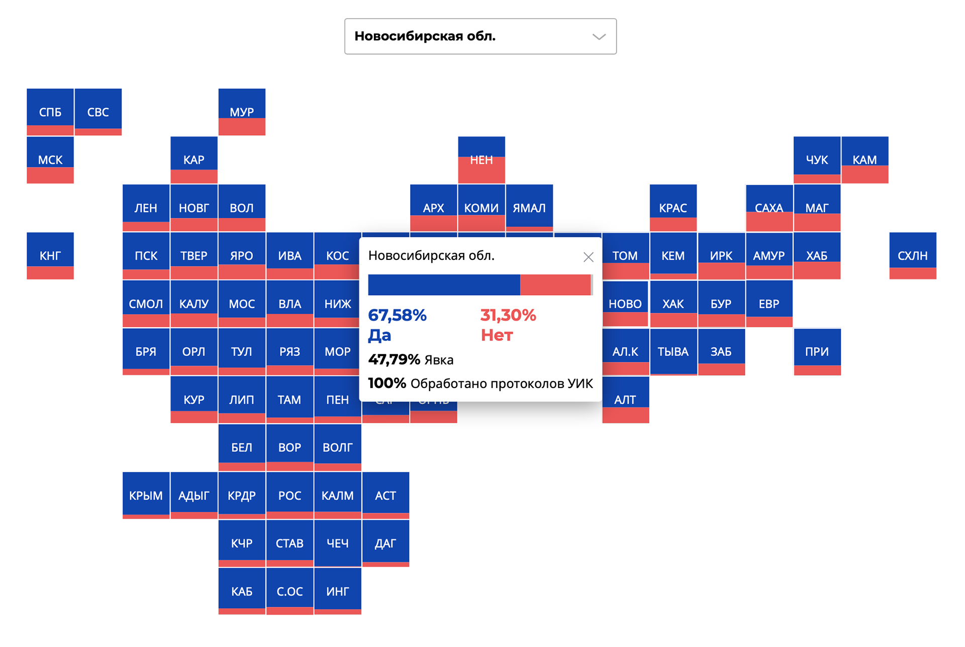
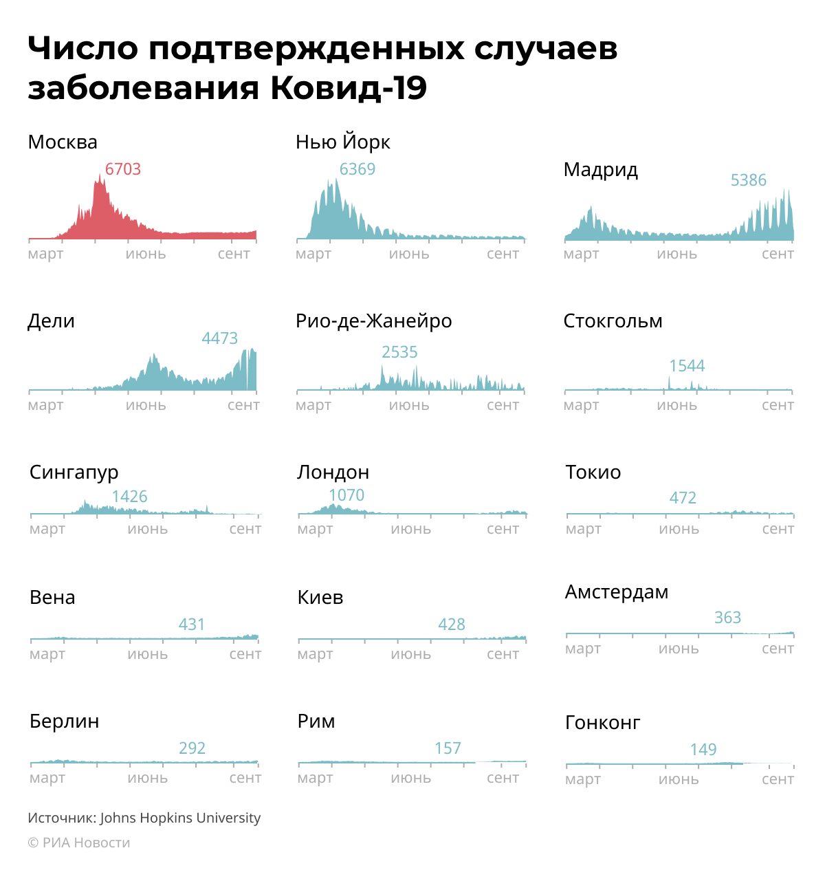
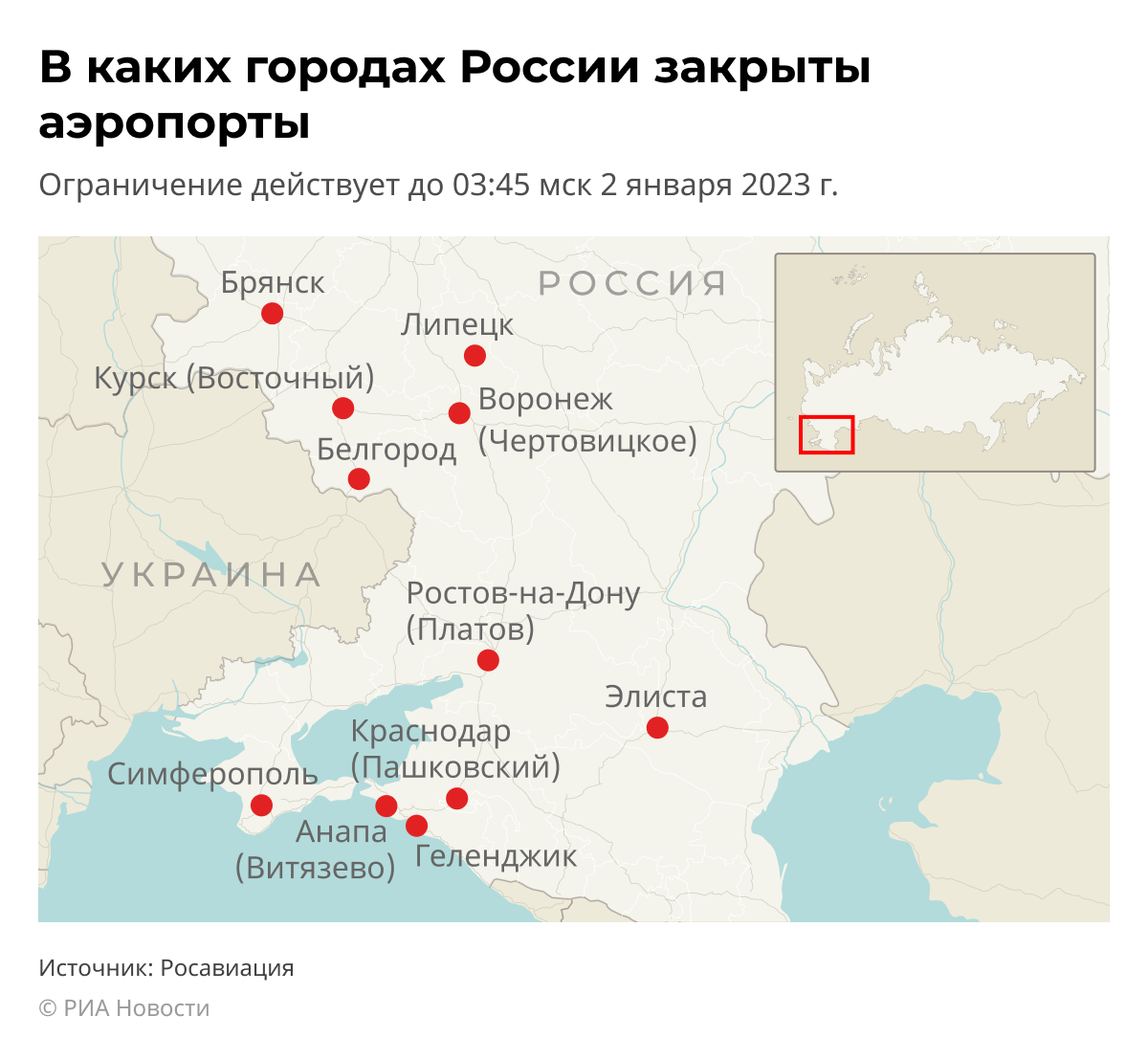
For example, we made a template for a tiled map of Russia, which was used for various topics and tasks.
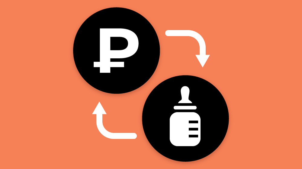
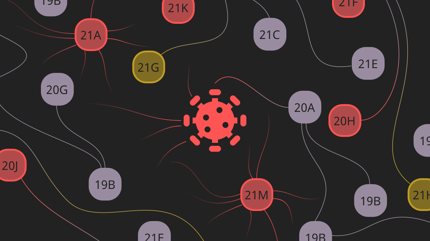
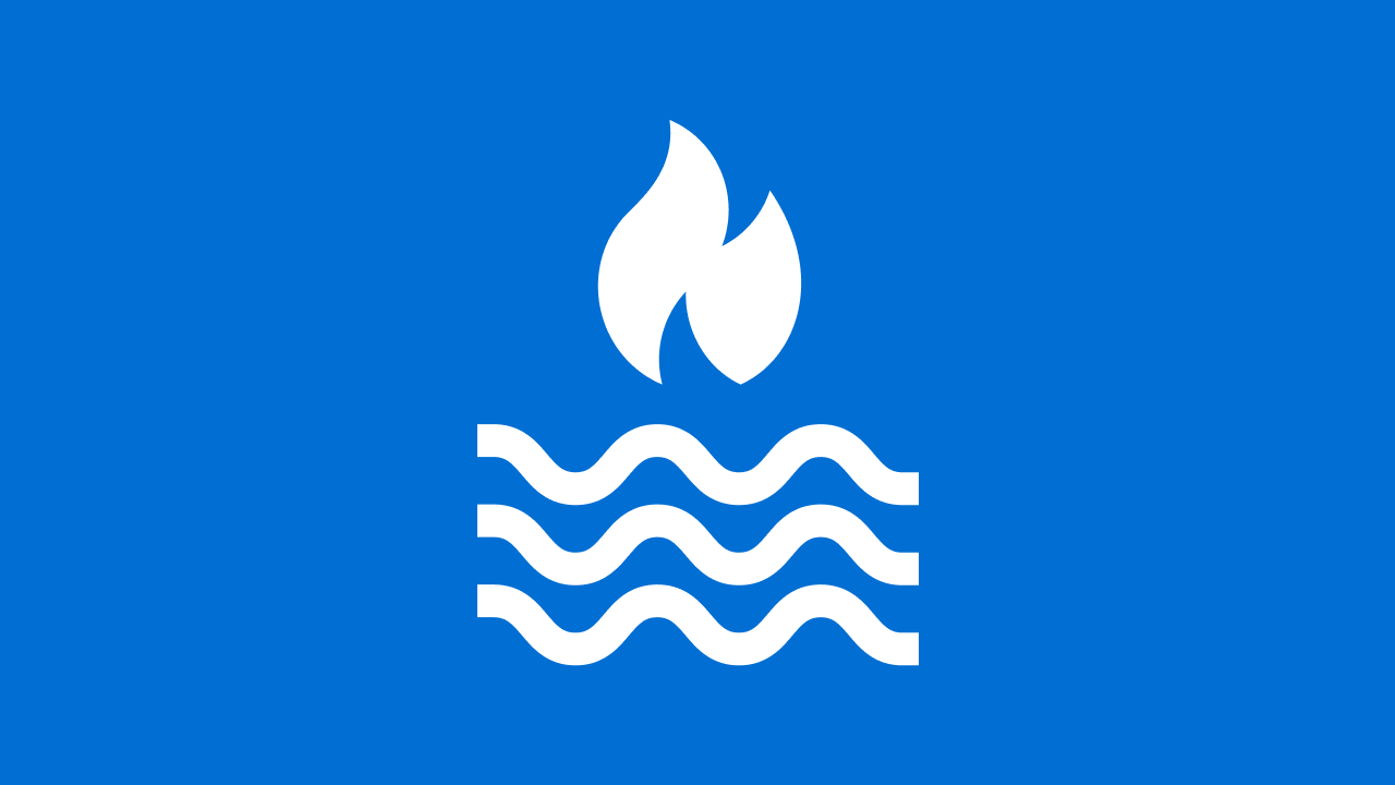
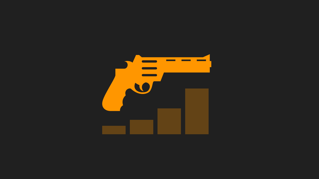
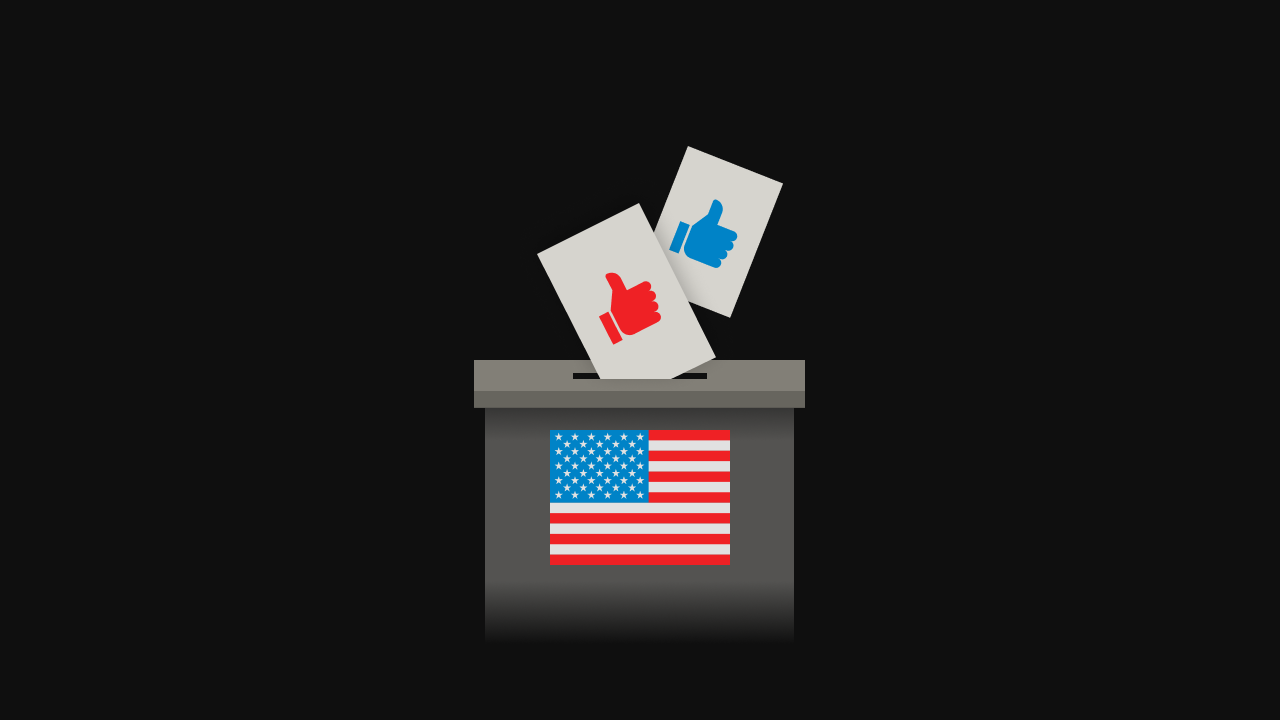
Metaphors in the covers
Purpose of the cover: to attract attention to publications, to be associated with the content. We formulated restrictions: an interesting metaphor, a dark background, an easy design, an icon in the center that is visible in different frame cuts


Reed more about department (on russian)
✦ Thanks for watching